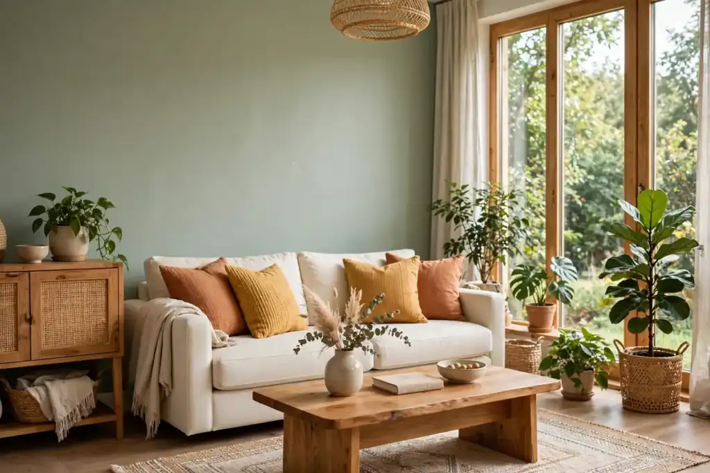
Walk into a room painted in soft sage green and you may feel your shoulders drop a little. Step into a bright red dining room and the same space can feel lively, warm and full of appetite. Colour does more than decorate a wall. It changes how large a room feels, how restful or energising it seems, and even how long you want to stay in it. That is why colour psychology, the study of how colours affect mood and behaviour, has become such a useful tool for anyone decorating a home.
Colour psychology is not a set of rigid rules, and it is certainly not magic. A colour that feels calming to one person may feel cold to another, because personal memories, culture and the light in a particular room all play a part. What colour psychology does offer is a practical starting point. It helps you understand the general tendencies of each colour family, so you can choose shades with intention rather than guesswork, and then test them in your own home before committing. Used well, it turns decorating from a gamble into a series of small, confident decisions.
How Colour Affects Mood at Home
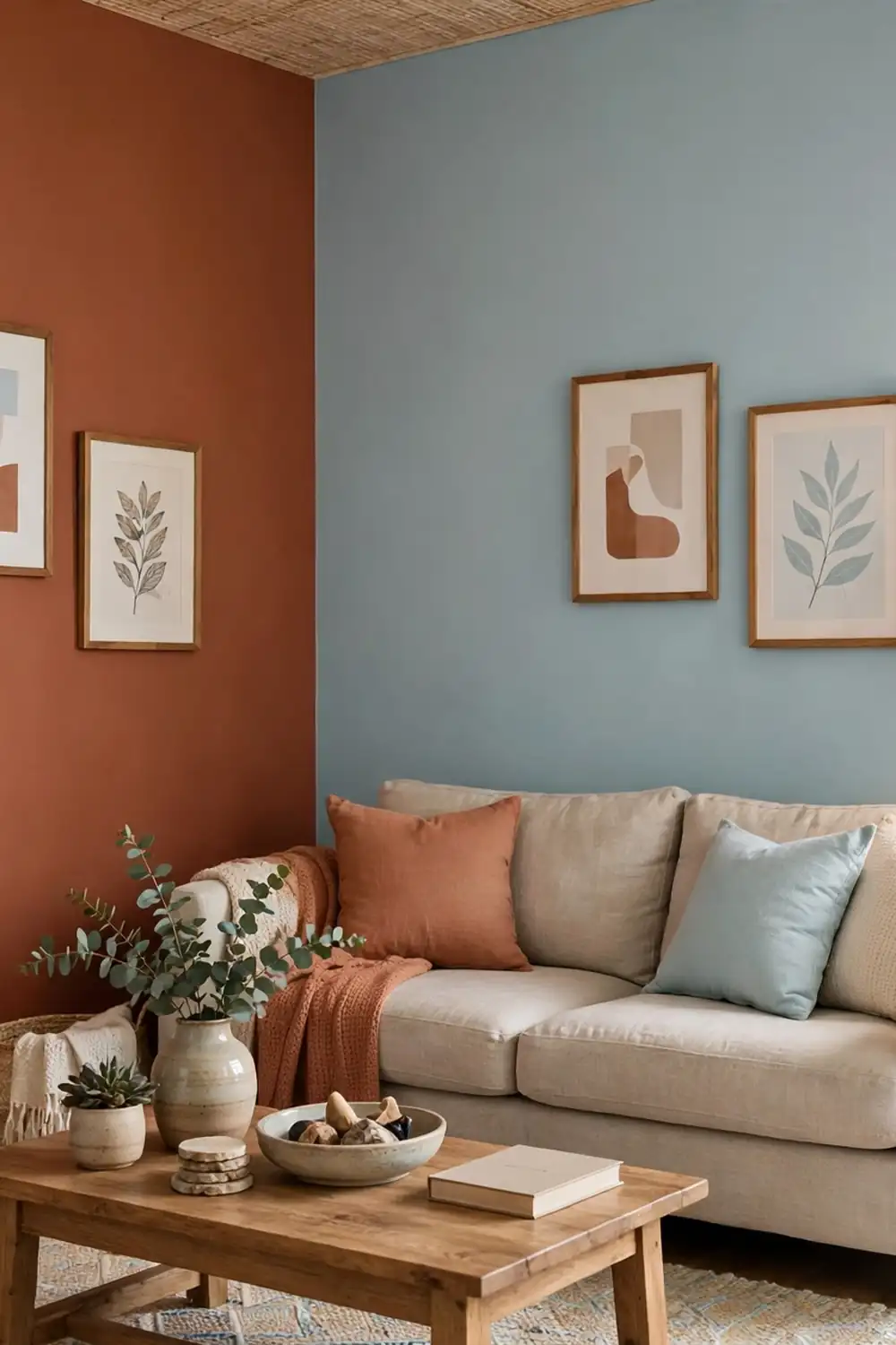
Three qualities decide how a colour feels in a room: its temperature, its lightness, and its intensity. Temperature describes whether a colour feels warm or cool. Warm colours such as reds, oranges and yellows tend to feel welcoming and stimulating, and they can make a large room feel more intimate. Cool colours such as blues, greens and violets tend to feel calm and restful, and they can make a small room feel a little more open. Neither group is better than the other. The right choice depends on what you want the room to do.
Warm and cool colours
Warm colours appear to advance towards the viewer, which is why a terracotta accent wall can make a long room feel shorter and cosier. They are natural choices for social spaces where you want conversation and energy, such as living rooms and dining rooms. Cool colours, by contrast, appear to recede, which helps a narrow bedroom or a small bathroom feel less cramped. A useful trick is to pair a dominant cool colour with a small warm accent, for example pale blue walls with honey-toned wood and a rust-coloured throw, so the room feels calm without feeling chilly.
Light, dark and intensity
Lightness matters just as much as hue. Pale shades reflect more light and generally make rooms feel larger, airier and fresher, while dark shades absorb light and create drama, intimacy and a sense of enclosure. A deep navy study can feel wonderfully cocooning, but the same navy in a windowless hallway could feel gloomy. Intensity matters too. A soft, muted version of a colour is usually easier to live with over large areas than a vivid, saturated one. Bright yellow on one feature wall can be joyful, while bright yellow on every wall can quickly feel tiring. As a rule, use the boldest shades in smaller doses and let softer shades do the heavy lifting.
The Main Colours and What They Do
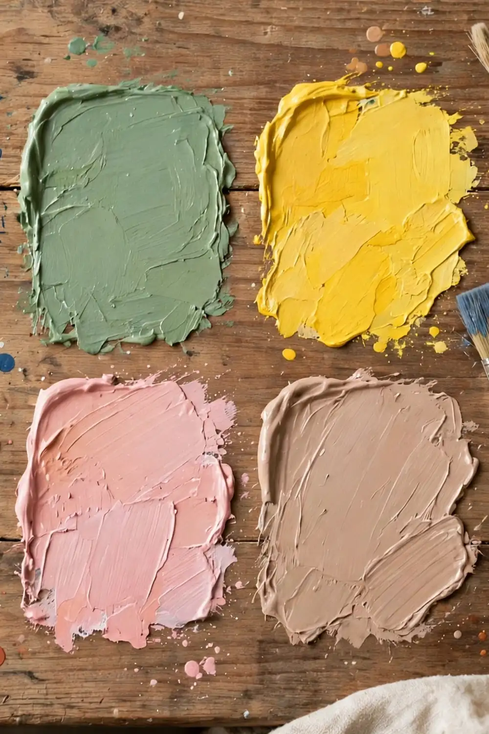
Every colour carries a set of common associations, built up through nature, culture and everyday experience. Blue reminds us of sky and water. Green recalls leaves and grass. Yellow brings to mind sunshine. These associations are not universal laws, but they are strong enough to guide sensible decorating choices. The sections below explain what each colour family tends to bring to a room, and where it works best.
Blues: calm and focus
Blue is the most widely liked colour in home interiors, and for good reason. Soft and mid blues are linked with calm, clarity and trust, which makes them ideal for bedrooms, bathrooms and home offices. A pale powder blue can make a bedroom feel serene and restful, while a deeper teal or navy adds depth and a sense of quiet confidence to a study or a living room. Blue also pairs beautifully with white, natural wood and warm metallics such as brass, which stops it feeling cold. In north-facing rooms, choose a blue with a slightly warm undertone, or balance it with warm wood and textiles, so the room stays inviting.
Greens: balance and rest
Green sits in the middle of the spectrum and is often described as the most restful colour for the eyes. It is associated with nature, balance and renewal, and it works in almost every room of the house. Sage green is a favourite for kitchens and living rooms because it feels fresh without being loud, while deep forest green brings richness and drama to a dining room or a bedroom. Green also connects the indoors with the outdoors, so it is a natural choice for rooms that open onto a garden. Pair it with cream, stone and timber for a soft organic look, or with black accents and brass for something more tailored.
Yellows: energy and cheer
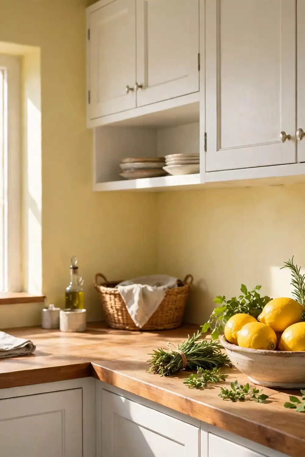
Yellow is the colour of sunshine, optimism and creativity, and it can lift a dull room like nothing else. It is a strong choice for kitchens, breakfast rooms and hallways, where a burst of cheerfulness is welcome first thing in the morning. The key with yellow is restraint. Buttery, muted yellows are warm and easy to live with, while bright, acidic yellows are best kept to accents such as cushions, artwork or a single painted chair. In a room with little natural light, a warm yellow can compensate beautifully, but always test it on the wall first, because yellow changes more dramatically under artificial light than most other colours.
Reds and oranges: warmth and appetite
Red is the most stimulating colour in the palette, linked with passion, energy and appetite. It can raise the pulse and spark conversation, which is why it has long been used in dining rooms and restaurants. In a home, red works best in measured doses: a burgundy accent wall, terracotta tiles, or deep red cushions and curtains. Orange is a friendlier, softer relative, associated with warmth, enthusiasm and sociability. Burnt orange and terracotta are particularly fashionable at the moment, and they suit living rooms and entryways well, especially alongside cream, wood and natural textures. Both colours should be used with care in bedrooms, where their stimulating quality can work against rest.
Purples and pinks: luxury and softness
Purple has long been associated with luxury, creativity and individuality. Deep plum and aubergine can make a bedroom or a reading corner feel rich and enveloping, especially with velvet textures and warm lighting. Lighter lavenders and lilacs feel softer and more romantic, and they work well in bedrooms and bathrooms. Pink, meanwhile, ranges from playful blush to confident coral. Soft blush pink is calming and gentle, and it pairs elegantly with grey, cream and sage. Stronger pinks and corals bring energy and warmth, and they can be a wonderful accent in a living room or a hallway. As with red, keep the boldest pinks to accents unless you are deliberately aiming for drama.
Neutrals: the quiet backbone
Neutrals, including white, cream, beige, grey and greige, are the backbone of most successful interiors. They rarely steal the show, but they let other colours shine, and they give a room a sense of calm and order. Warm neutrals such as cream and warm beige feel welcoming and timeless, while cool greys feel sleek and contemporary. The mistake many people make is choosing a neutral that is too cold or too flat for their light, which can leave a room feeling dull rather than serene. Look for neutrals with a hint of warmth, layer different textures such as linen, wool and wood, and add colour through artwork, cushions and plants so the room feels finished rather than bare.
Room-by-Room Colour Guide
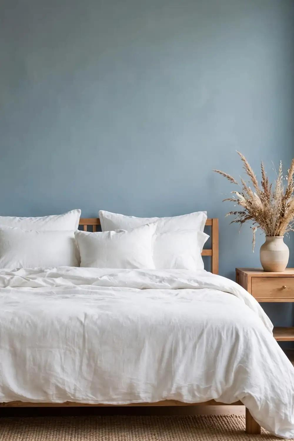
Different rooms ask different things of colour. A bedroom should help you unwind, a kitchen should feel fresh and sociable, and a home office should support concentration. The guide below offers a starting point for each room, but treat it as inspiration, not instruction. Your light, your furniture and your own taste will always have the final say.
Living room: welcoming and flexible
The living room is usually the most social space in the house, so it benefits from colours that feel welcoming without being overpowering. Warm neutrals, soft greens and muted blues all work well as a base, with warmer accents in cushions, throws and artwork to add personality. If your living room is large and open-plan, a deeper accent wall can help define the seating area and make the space feel more intimate. If it is small, keep the walls pale and bring colour in through textiles and plants, which are easy to change with the seasons.
Kitchen and dining room: fresh and appetising
Kitchens suit fresh, clean colours that feel hygienic and cheerful: soft whites, pale greens, buttery yellows and light blues. These shades bounce light around and make early mornings feel a little brighter. Dining rooms, by contrast, can take more drama. Warm reds, terracotta, deep green and plum all encourage lingering over a meal, especially under warm, dimmable lighting. If you are planning the layout and mood of this space, our guide to dining room design ideas offers practical advice on furniture, lighting and arrangement to go with your colour choices.
Bedroom: restful and personal
The bedroom is the one room where calm should win over excitement. Soft blues, greens, lavenders and warm neutrals are all proven choices, because they lower visual stimulation and help the mind wind down. Avoid very bright or highly saturated colours on large wall areas here, and be cautious with red and vivid orange. Instead, choose a soothing wall colour and add personality through bedding, curtains and artwork, which can be changed easily if your taste shifts. A slightly darker shade on the wall behind the bed can create a cosy focal point without overwhelming the room.
Bathroom: clean and spa-like
Bathrooms benefit from colours that feel clean, fresh and spa-like. Pale blues, sea greens, soft whites and warm stone shades all work well, especially with natural materials such as wood, stone and cotton towels. Because bathrooms are often small and sometimes windowless, pale colours and good lighting matter more here than in any other room. If you want drama, consider deep green or navy on one wall or in the tiles, balanced by white sanitaryware and a large mirror to keep the space feeling open.
Home office: focused and calm
A home office needs colours that support concentration without feeling sterile. Mid blues and greens are excellent choices, because they are calming yet alert, and they look good on camera for video calls. Avoid very bright colours that can distract, and avoid all-white schemes that can feel clinical over a long working day. A soft sage or dusty blue wall, with warm wood furniture and a plant or two, strikes a good balance. If your office doubles as a spare room, choose a colour that also feels welcoming to guests, and add personality with artwork rather than bold wall colour.
Hallway and entry: a confident first impression
Hallways are often overlooked, yet they set the tone for the whole house. Because they are usually narrow and short on natural light, pale and warm colours work best: soft cream, warm white, pale yellow or light sage. A bolder colour can work in a hallway with good light and high ceilings, and a deep, dramatic hallway can feel wonderfully theatrical when it opens into a lighter living room. Keep the colour continuous with the rooms it connects to, or use it as a gentle transition between them, so the house feels coherent rather than chopped into unrelated boxes.
Building a Colour Scheme That Works
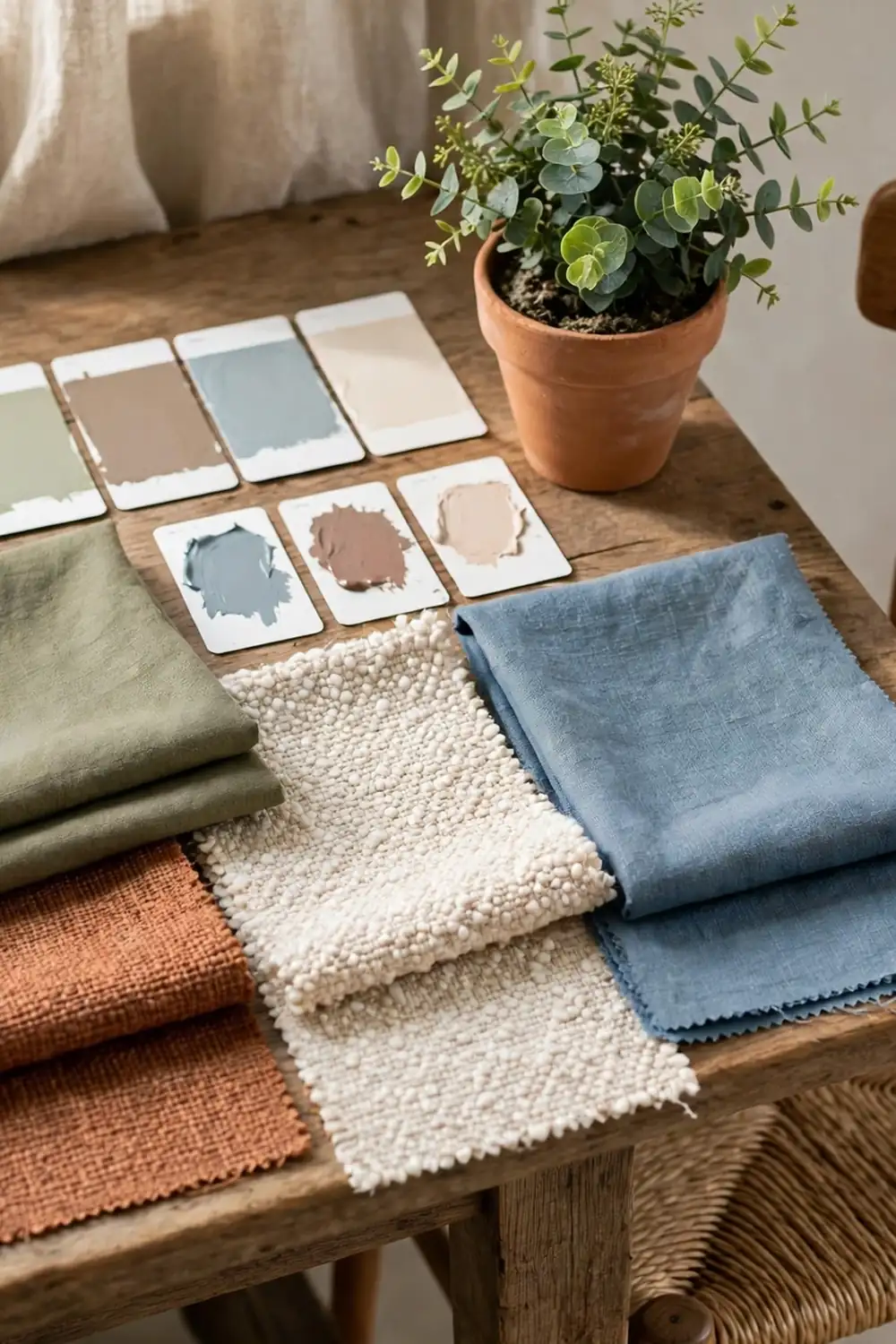
Knowing what individual colours do is only half the job. The other half is combining them into a scheme that feels coherent rather than random. Fortunately, a few simple frameworks make this much easier, even if you have no design training. The best schemes are usually simple: a small number of colours, repeated consistently, with one or two accents for interest.
The 60-30-10 rule
The classic 60-30-10 rule divides a room into three proportions. Roughly sixty percent is the dominant colour, usually the walls and large areas of flooring. Thirty percent is the secondary colour, found in furniture, curtains and rugs. Ten percent is the accent colour, appearing in cushions, artwork, vases and other small details. For example, a living room might be sixty percent warm white walls, thirty percent sage green sofa and curtains, and ten percent terracotta and mustard accents. The rule is not a law, but it prevents the common problem of having too many colours competing at equal strength, which is what makes a room feel busy rather than designed.
Test before you commit
Paint colours look different on a wall than they do on a small card in a shop, and they change through the day as the light shifts. Always test a colour before painting a whole room. Paint a large sample, at least a metre square, on the wall, or paint a board you can move around the room. Look at it in morning light, evening light and under your usual artificial lighting, and live with it for a few days if you can. Pay attention to how it looks next to your flooring, your furniture and your woodwork, because those fixed elements will influence how the colour reads. A colour that looks perfect in isolation can clash badly with an orange-toned wooden floor or a pink-toned carpet.
Combining colours with confidence
If you are unsure which colours go together, start with nature. Leaf green and sky blue, sand and sea tones, autumnal rust and cream: these combinations work because we see them every day and our eyes accept them instantly. Another reliable approach is to pick colours that sit near each other on the colour wheel, such as blue and green, for a calm, harmonious feel, or colours opposite each other, such as blue and orange, for a livelier contrast. Keep the number of strong colours small, and let neutrals and natural materials do the quiet work of holding the scheme together. Affordable accessories are a low-risk way to try a new accent colour before committing to it on a wall, and our round-up of affordable decor items every home needs is a useful place to start.
Common Colour Mistakes to Avoid
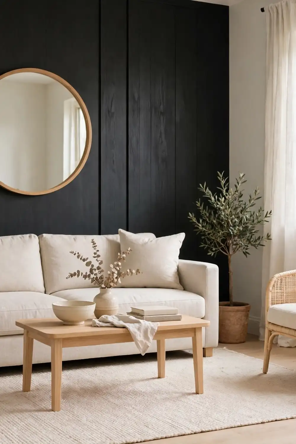
The most common colour mistake is choosing paint from a tiny swatch under shop lighting and then being surprised by the result at home. The second is painting every wall in a bold colour, which leaves the eye nowhere to rest. A bold colour is almost always more effective on one wall, or in smaller doses through furniture and accessories, than spread across an entire room. A third mistake is ignoring the undertones of neutrals. A grey with a blue undertone can feel icy in a north-facing room, while a cream with a yellow undertone can look unexpectedly warm in strong sunlight. Always compare your chosen shade against pure white and against your existing furnishings to spot undertones before you buy.
Another frequent error is forgetting that colour does not exist in isolation. Lighting changes everything: warm bulbs make colours look warmer and cosier, while cool daylight bulbs make them look crisper and sometimes colder. Gloss and matt finishes also change how a colour reads, with matt finishes looking softer and glossier finishes reflecting more light. Finally, do not be afraid to break a rule that is not working for your home. Colour psychology offers guidance, but if a deep red bedroom helps you feel cosy and happy, and you sleep perfectly well in it, then it is the right colour for you. Your home should reflect your life, not a textbook.
Good to Know
Colour psychology is best treated as a guide, not a guarantee. Research into colour and mood shows general tendencies, but individual responses vary with memory, culture and personal taste, and no single colour will transform your mood on its own. Light, layout, clutter, sound and scent all contribute to how a room feels, so colour works best as part of a broader approach to a comfortable home. If you are choosing colours for a room you share, involve everyone who uses it, and be prepared to compromise on a shade that suits you all.
It is also worth remembering that colour does not stop at the back door. The colours you see through a window, from garden planting to outdoor furniture, become part of the interior experience, especially in rooms that open onto a garden. Choosing garden colours that harmonise with your interior palette can make the whole home feel more coherent. Our guide to top garden design tips explains how to plan colour outdoors, from layered borders to seasonal interest, so the view from your window works as hard as the room itself.
FAQ
What is colour psychology in interior design?
Colour psychology in interior design is the practice of choosing colours based on how they tend to affect mood, energy and perception. Warm colours generally feel stimulating and sociable, cool colours generally feel calm and restful, and pale colours usually make rooms feel larger while dark colours make them feel more intimate. These are tendencies, not certainties, and they work best when combined with good lighting, sensible layout and your own taste.
Which colour is best for a bedroom?
Soft blues, greens, lavenders and warm neutrals are the most reliable bedroom colours, because they are calming and low in visual stimulation. Pale or muted versions work better than vivid ones, and a slightly darker shade behind the bed can add cosiness without overwhelming the room. Avoid large areas of bright red or vivid orange in a bedroom, as their stimulating quality can work against rest.
How can I make a small room feel bigger with colour?
Use pale, cool colours on the walls, keep the ceiling white or very pale, and choose flooring and furniture in light tones. Painting the walls and woodwork in the same pale shade removes visual breaks and makes the room feel more continuous. Add a mirror opposite a window to bounce light around, and bring colour in through accessories rather than dark wall paint.
What is the 60-30-10 rule?
The 60-30-10 rule is a simple proportion guide for colour schemes. About sixty percent of the room is a dominant colour, usually the walls, thirty percent is a secondary colour in furniture and curtains, and ten percent is an accent colour in cushions, artwork and small accessories. It keeps a scheme balanced and prevents too many strong colours from competing at once.
Should I follow colour psychology rules exactly?
No. Colour psychology offers useful guidance, but personal taste, memories, light and existing furniture matter just as much. If a colour that is supposed to be stimulating helps you relax, or a supposedly calming colour leaves you cold, trust your own response. Test colours in your own room and light, and choose what genuinely makes you feel at home.
How do I choose a colour for a north-facing room?
North-facing rooms receive cooler, bluer light, so they benefit from warm colours or warm-toned neutrals that compensate for the chill. Warm whites, buttery yellows, soft warm greens and warm greys all work well. Avoid very cool blues and stark whites, which can feel cold and flat in northern light, and use warm artificial lighting and wooden textures to add further warmth.






2 thoughts on “How to Use Colour Psychology in Interior Design”